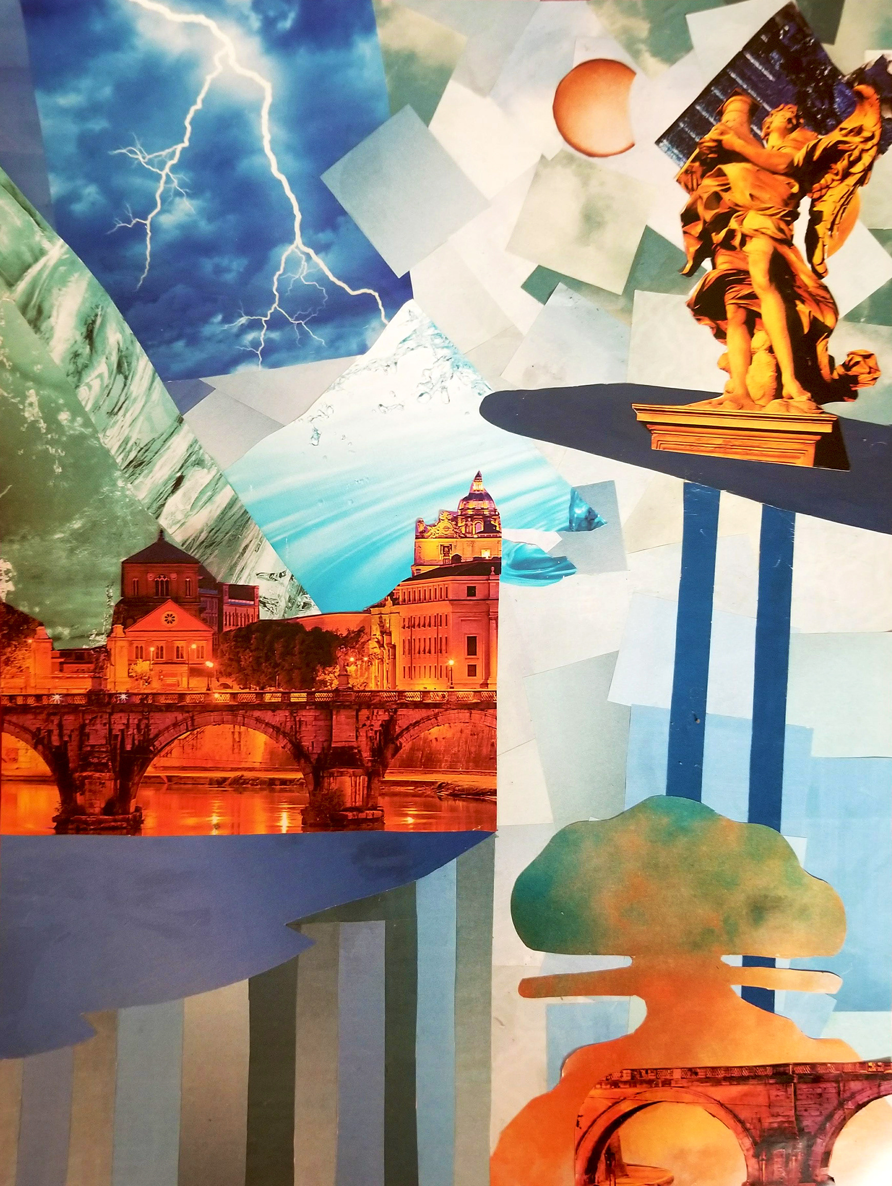
While studying color theory, I found myself infatuated with the complementary colors blue and orange. While I naturally dislike every other complementary combination, I find blue and orange very aesthetically pleasing. I considered this while brainstorming for an atmospheric perspective landscape idea I had been wanting to bring to life. At the time, I was also new to creating collages, so I reasoned that it was time to really test myself by combining all of these ideas. Notably, I also wanted to create either a utopian or dystopian societal landscape. Another of my natural tendencies is to favor the surreal and the darker, more dramatic emotions, so dystopian was the easy choice.
It is titled "Perdition," as I wanted it to seem "hellish" and confusing in a sense, not necessarily actual hell, but like your existence in this place is a punishment. The sky and "sun" or "moon" show us that we are obviously not on our Earth, so I added the buildings and statue, things we associate with stability and order amidst chaos, to act as stabilizers, showing that this place is inhabited. I was really lucky to find those architectural pieces bathed in orange light. For this piece, I utilized magazines entirely and found as many shades/tints/tones of orange and blue as I could.