After creating the Willow Falls logo and graphics for a client, I was contacted by the same client about rebranding their Landscape Construction business. I created a simple logo-focused branding guide that included a color palette based on client preference and suggested fonts, as well as a primary and alternate logo (by request).
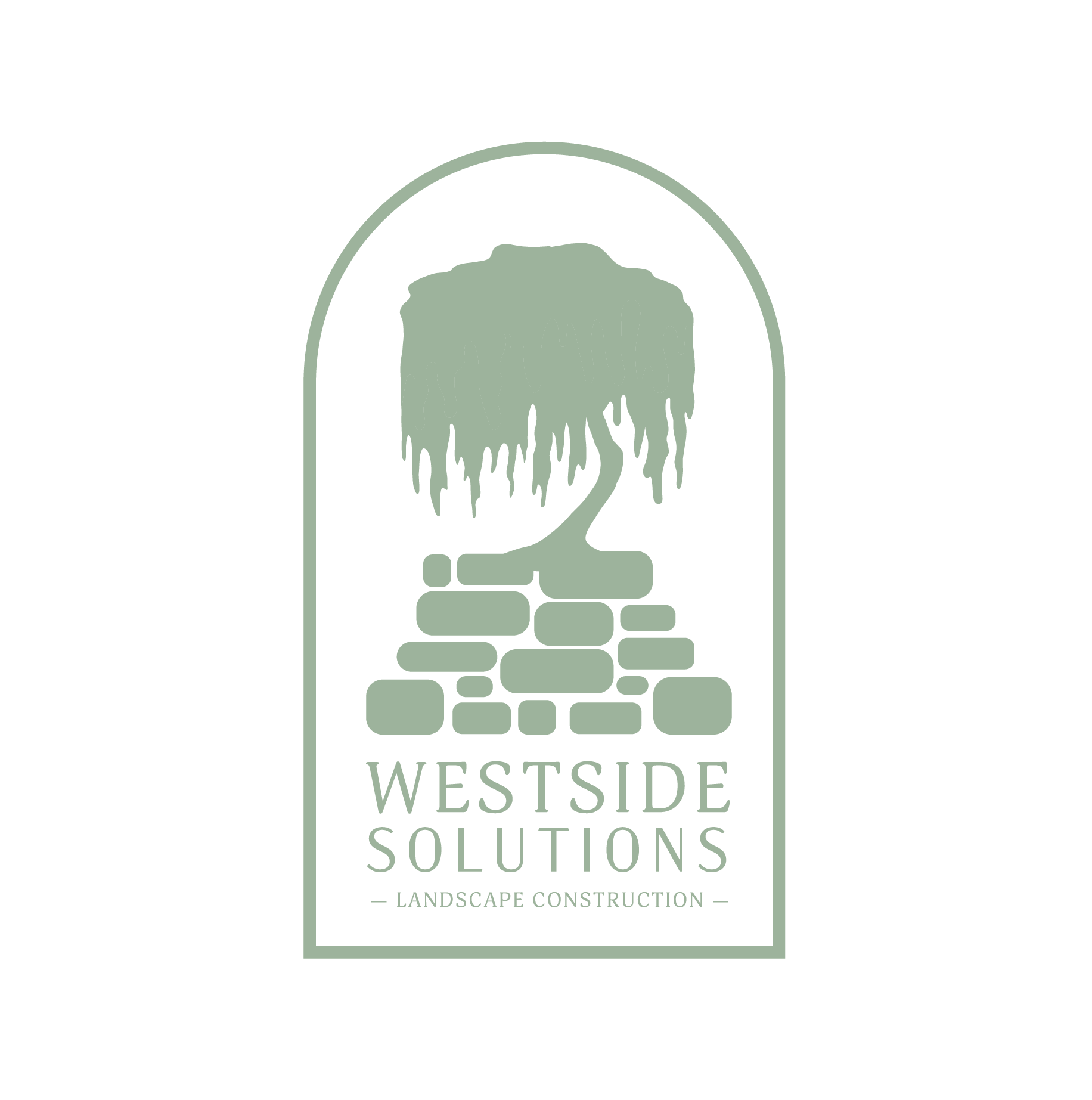
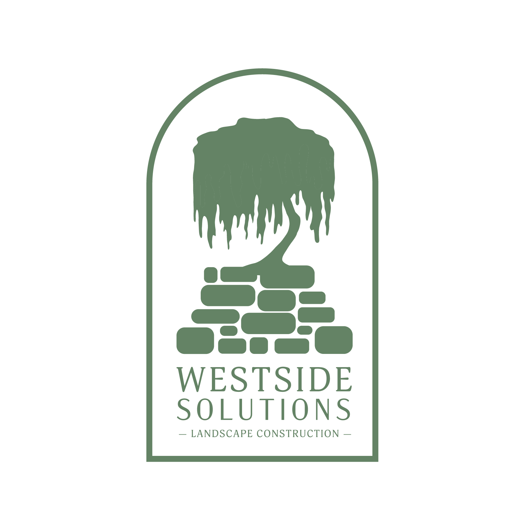
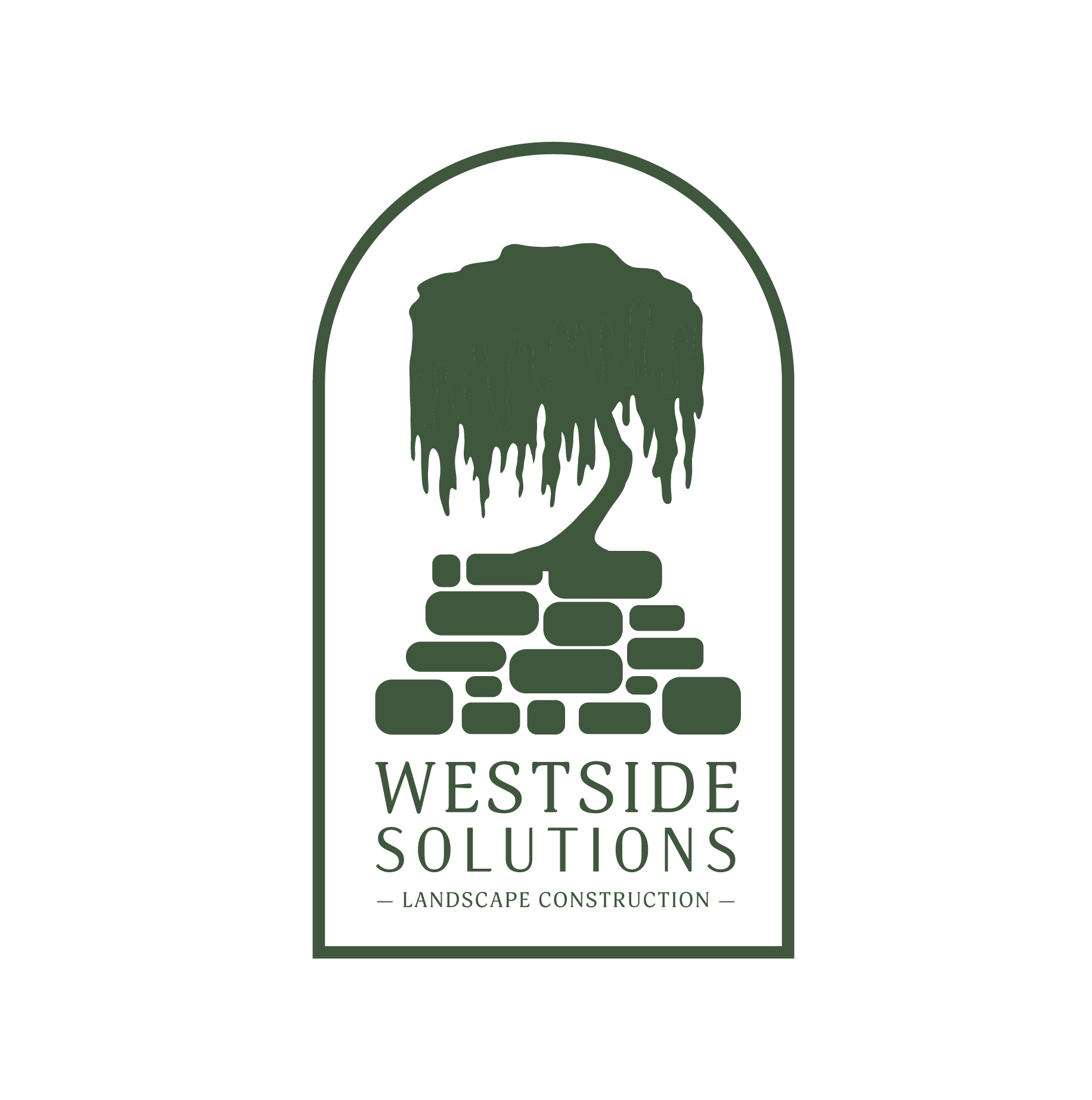
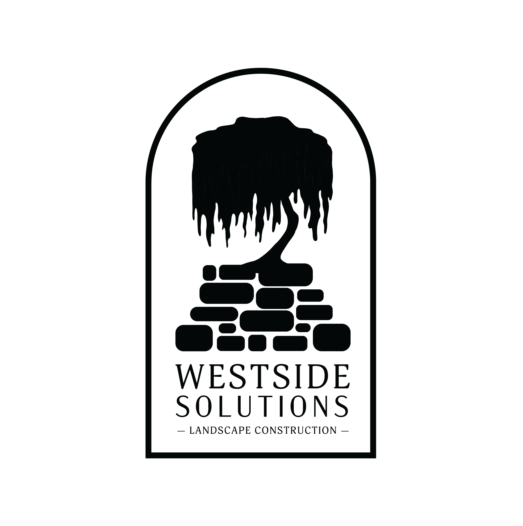
For their logo, the client provided a sketch example of their landscaping work. The final design was formed through several iterations focused on simplification of ideas and shapes to create a cohesive logo with recognizable iconography and a strong silhouette. The primary logo, as well as the alternate logo and some examples of earlier iterations of the design can be found below.
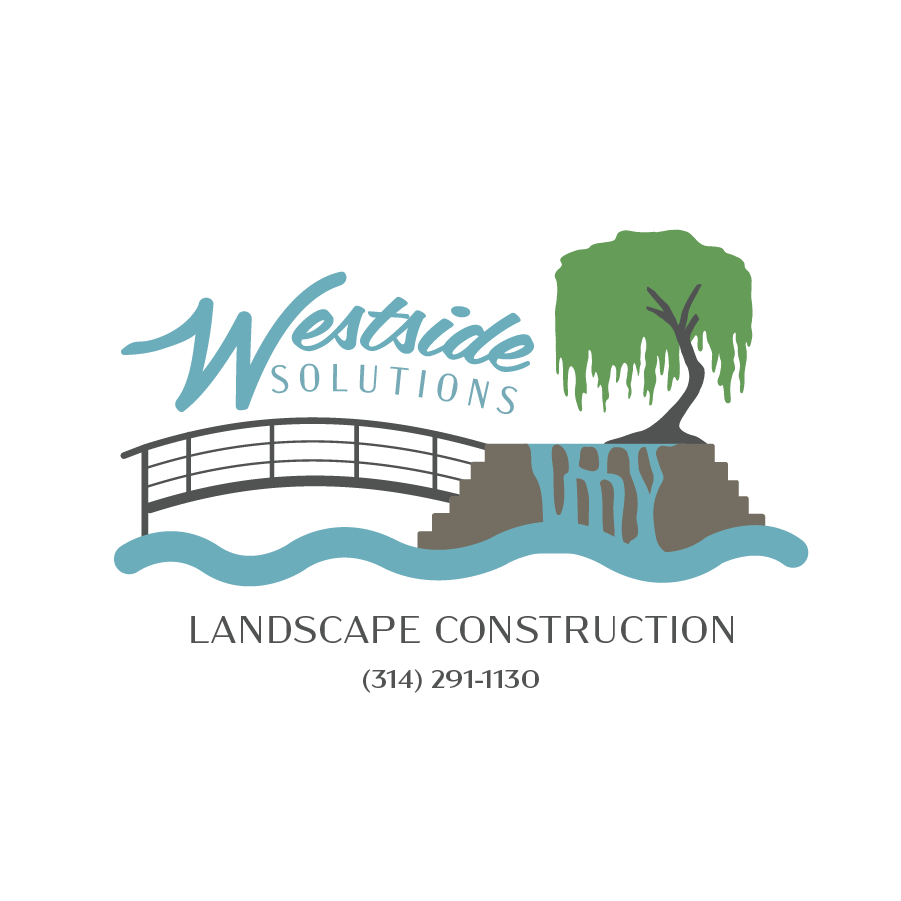
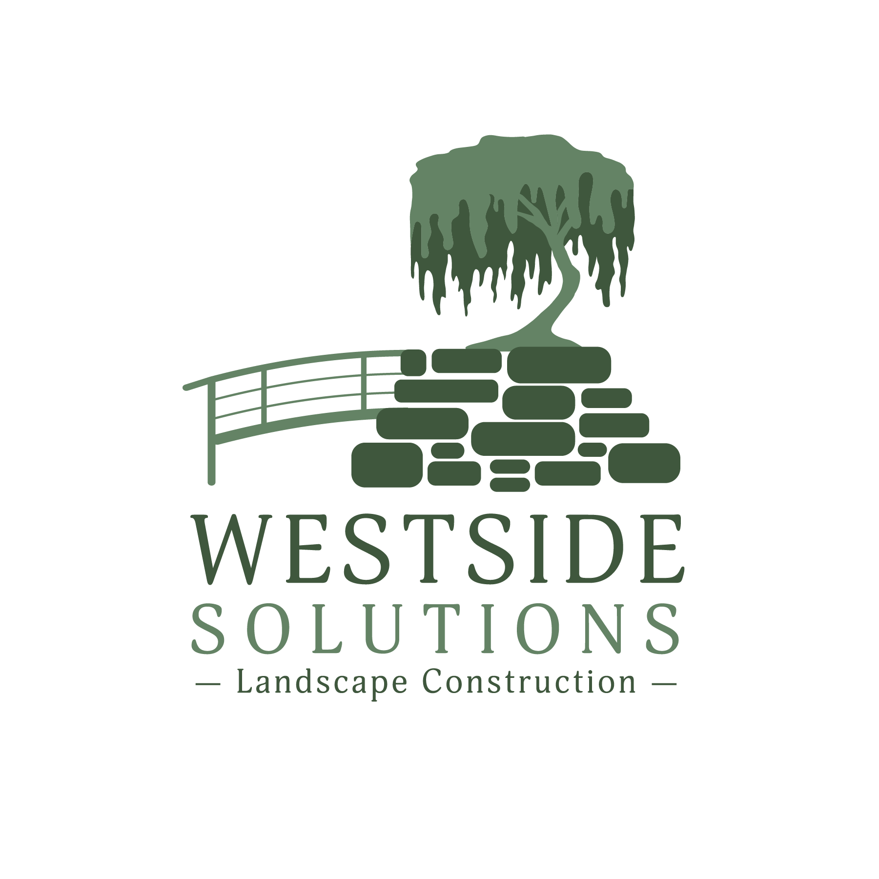
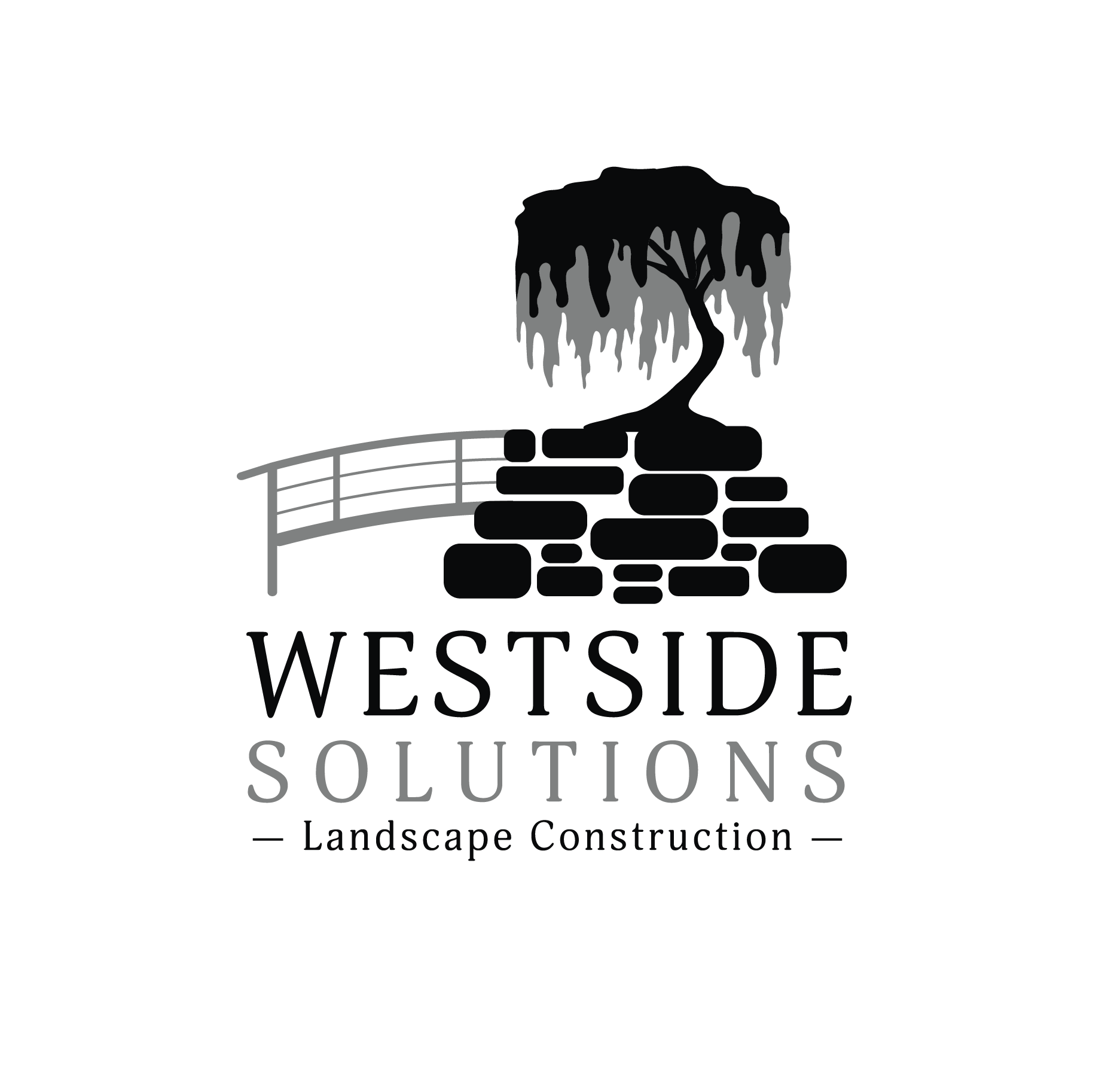
Primary Graphic Logo
This is the primary "graphic" logo created for general use and for the back-facing, large graphics on employees' shirts. I created several color variations, including two different two-tone versions, by request. These color variations are based on a palette I created based on the client's desire and to complement the branding for their other businesses. The two-tone green variant is the version the client primarily uses.


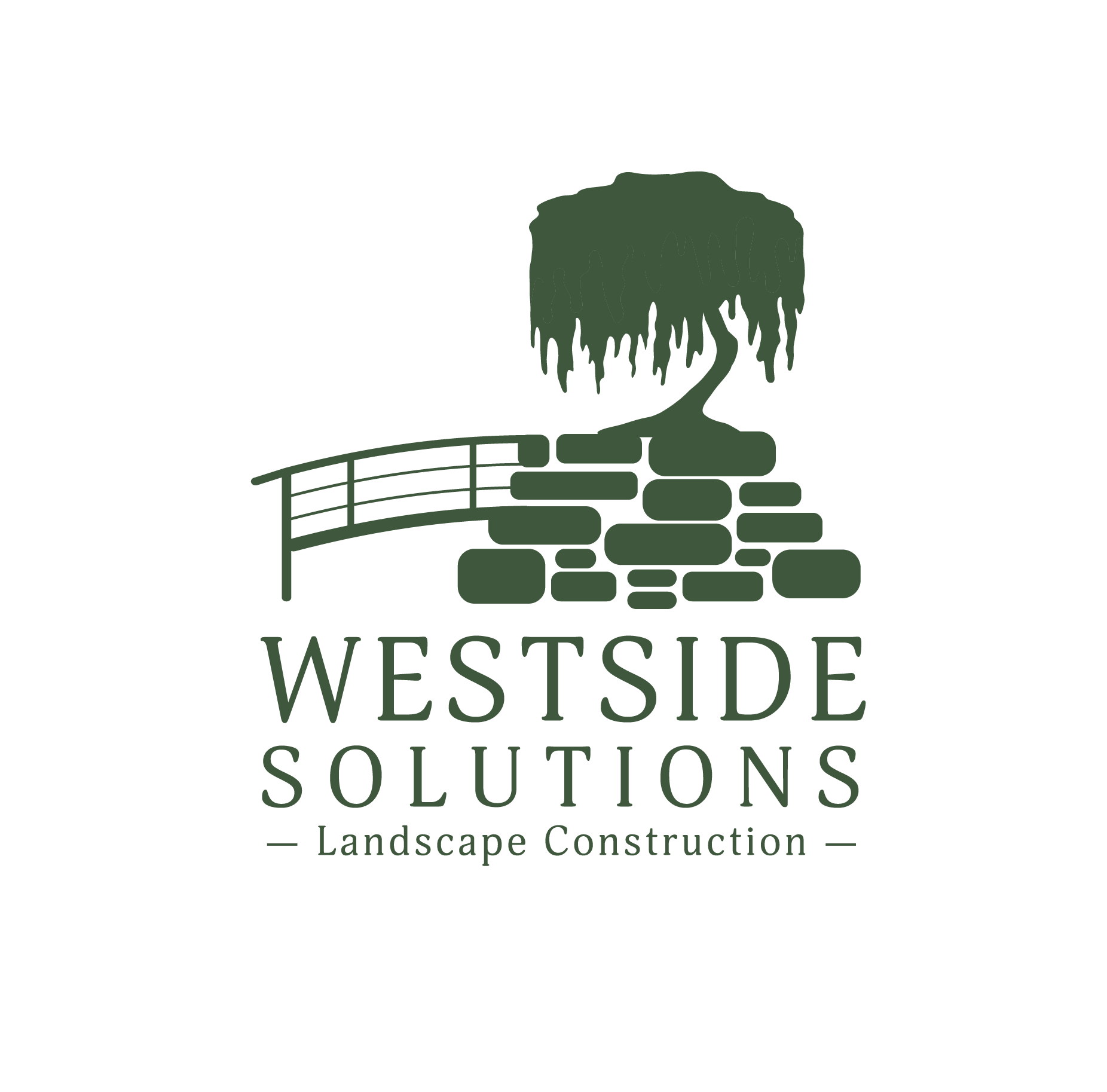
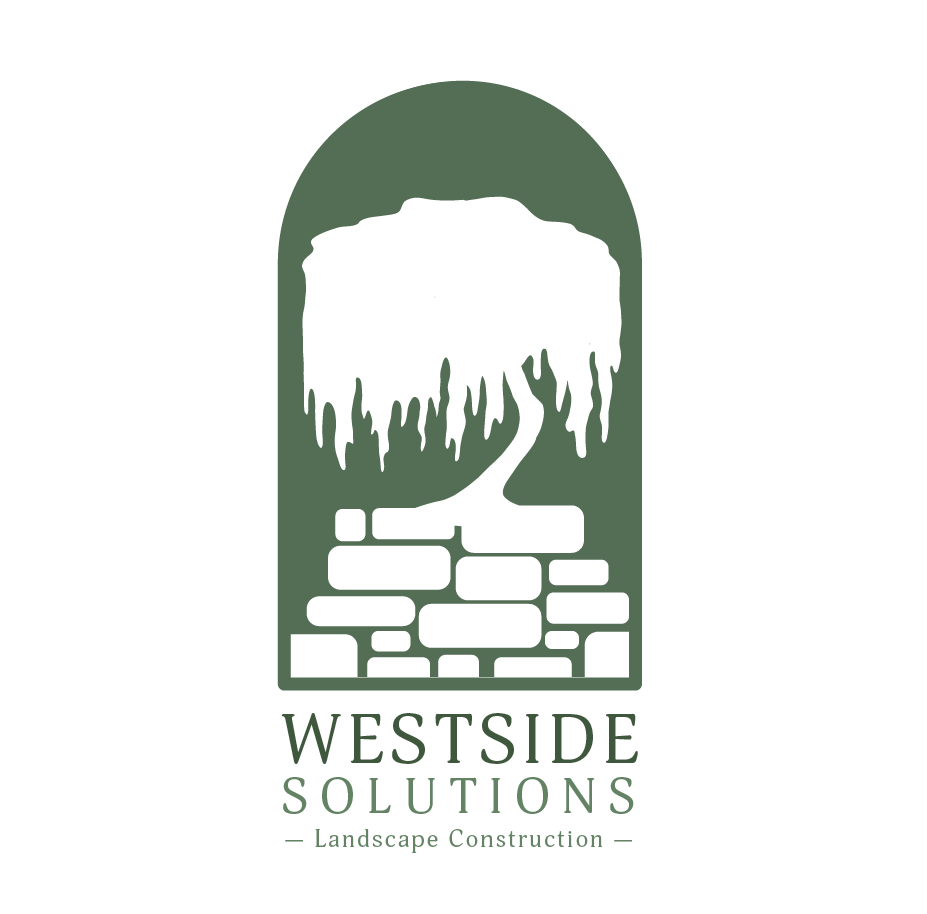
Alternate Logo
This is an alternate, simplified version of the logo created upon request. This design is primarily used for merchandise, like the front-facing "pocket" design on employees' shirts. Like with ther original design, this logo is available in several color variations for use on multiple backgrounds, in patterns, and on social media.
Early Iterations
The following images are examples of early designs based on the client's provided concepts and desires. The final designs are more modern, sleek, and streamlined, though some of the earlier versions have their own charm. The earliest iterations were much more colorful and complex by the client's request, but after I suggested simplifying the design and colors to be more suitable for a contemporary logo, the client was happy with the change in direction.
